The 20th century was a period of explosive creativity in the world of art, witnessing movements that forever changed the landscape of visual expression. Each artist brought a unique palette to the canvas, but what if we were to distill their essence into a single color? Let’s embark on a chromatic journey through the century, including the indelible impact of Vincent Van Gogh, to match these iconic painters with colors that encapsulate their spirit and legacy.
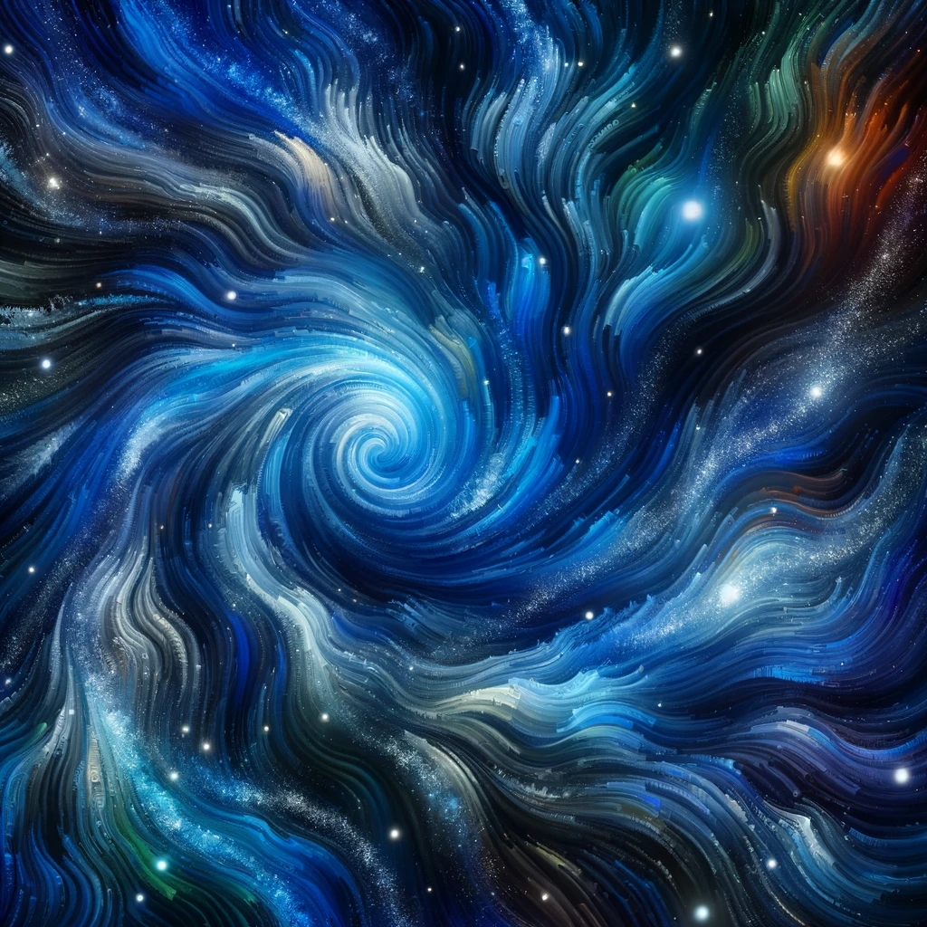
Vincent Van Gogh: Starry Night Blue
Though Van Gogh’s life tragically ended in 1890, his influence cascaded into the 20th century and beyond. The color that best represents him is the deep, vibrant Starry Night Blue. This hue captures the emotional intensity and turbulent beauty of his masterpiece “The Starry Night,” reflecting his passionate soul and the profound depth of his work that preluded modern art movements.
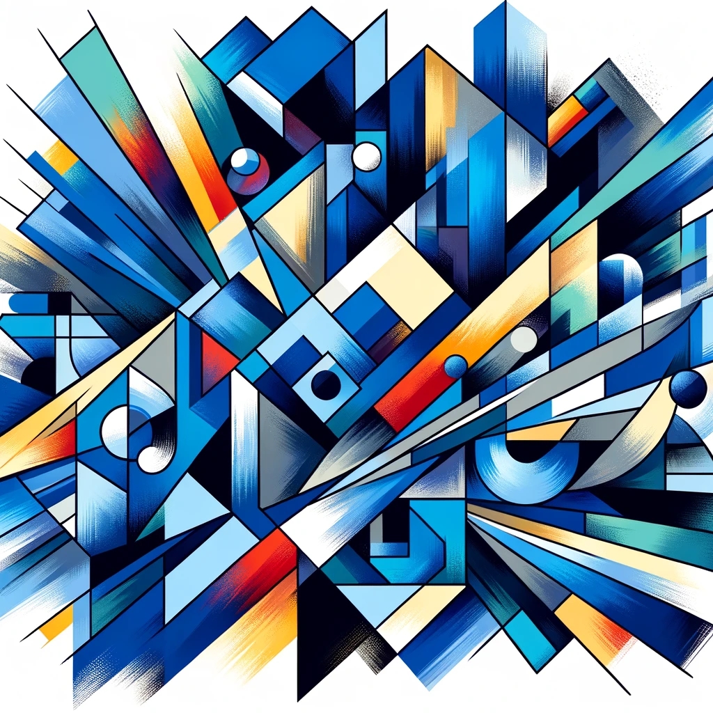
Pablo Picasso: Cubist Blue
Picasso, a titan of modern art, is synonymous with the Cubist Blue of his Blue Period and the geometric abstraction of Cubism. This color symbolizes the innovation and emotional depth that Picasso brought to his art, representing both the sorrow of his early works and the groundbreaking nature of his later cubist compositions.
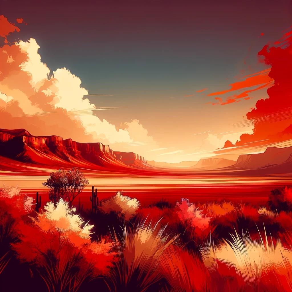
Georgia O’Keeffe: Desert Red
Desert Red embodies Georgia O’Keeffe’s vast, vibrant depictions of the American Southwest. This color captures the raw, natural beauty and the intense, fiery spirit that O’Keeffe infused into her paintings of red hills, flowers, and desert landscapes, reflecting her pioneering role in American Modernism.
Jackson Pollock: Splatter Silver
For Jackson Pollock, Splatter Silver represents the revolutionary technique of drip painting that defined his most famous works. This metallic hue symbolizes the dynamic energy, movement, and chaos inherent in Pollock’s action paintings, embodying the radical break from traditional painting techniques that he championed.
Mark Rothko: Meditative Magenta
Rothko’s color field paintings, known for their emotional depth achieved through color alone, are best represented by Meditative Magenta. This deep, saturated hue reflects the spiritual, transcendental quality of Rothko’s work, inviting introspection and a profound emotional response from the viewer.
Frida Kahlo: Vibrant Teal
Vibrant Teal mirrors Frida Kahlo’s intense and vivid self-portraits, which often incorporated lush, green foliage and rich Mexican cultural motifs. This color represents Kahlo’s resilience, her deep connection to her Mexican heritage, and the vibrant intensity of her art and life.
Conclusion
Art is a spectrum where each color and each stroke can tell a thousand stories. By associating these legendary artists with specific colors, we not only celebrate their contributions to the world of art but also highlight the emotional and intellectual depth that colors bring to our lives. These hues serve as a gateway into understanding the essence of each artist’s work, inviting us to see the world through their eyes and feel the heartbeat of their creativity.

You must be logged in to post a comment.